I’ve been using an Android phone for over 12 years. In that time, I’d never felt the temptation to move to iOS. I do use some Apple products; I’ve been an iPad owner since 2020, but this year, I felt curious about the iPhone in a way I hadn’t before. iOS 18 addressed a lot of the issues I had with the OS, and I found myself using my iPad Pro more often through the developer previews and the betas.
With year-on-year improvements stagnating in the smartphone space, maybe the way to get excited again is to try something else. So, for the last month, I’ve used an iPhone 16 Pro to answer that all-important question: is Android still the OS for me?
Aside from my own curiosity, I realized that trying a modern iPhone would improve the way I cover Android phones. Being able to compare phones against their competitors is essential when reviewing and recommending them, so if nothing else, this experience will be worth it to improve my work.
I like the Camera Control
For everything except taking the photo
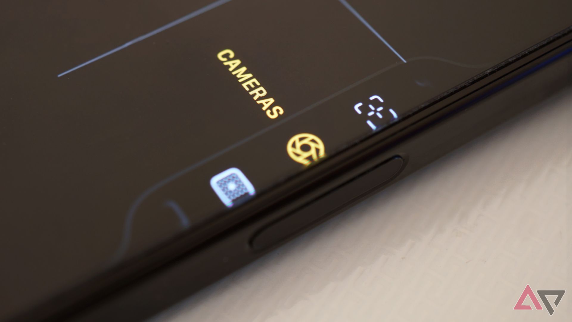
One of the additions to the iPhone 16 series is the Camera Control, and it’s been controversial, to say the least. Despite Apple’s refusal to call this a button, that’s exactly what it is. It is a physically moving button that takes a photo when pressed.
There is more to it, though. Using the same technology you’ll find in the older iPhone home button from the iPhone 7, or the trackpads on MacBooks, you can “half-press” the camera control, and it feels like a physical press thanks to some stellar haptics.
It’s not perfect, though, and I understand why people take issue with it. Many find it difficult to judge how much pressure to apply for the half-press, although I didn’t think it was that bad. The criticism I do agree with, though, is the fact it’s a button at all. Because of the half-press shenanigans, it takes a lot more force to fully click the button than it normally would, so many of the photos I’ve taken using this as a shutter button have resulted in a shaky, blurry photo.
How do I use the Camera Control, then? The first thing I use it for is launching the camera. Unlike Android phones, which let you launch the camera by double pressing the power button, the iPhone hasn’t had a convenient way of launching the camera until now. I know you could swipe from the lock screen or use the lock screen shortcut in the bottom right, but that means you need to wait for the screen to be on to open the camera.
Camera Control, like the power button on Android, lets you open the camera as you take your iPhone out of your pocket. It sits right where my thumb rests, so I can start taking photos right away.
In short, the Camera Control should’ve gone all in on not being a physical button. Relying on the haptic engine and the trickery Apple has well-executed on since 2016 would’ve resulted in a more consistent experience, eliminating all the blurry photos I’ve taken from having to press it so hard to capture. It’s so close to greatness, finally providing an easy way to launch the camera and living in a location I find comfortable.
I was wrong about Face ID
But only sort of
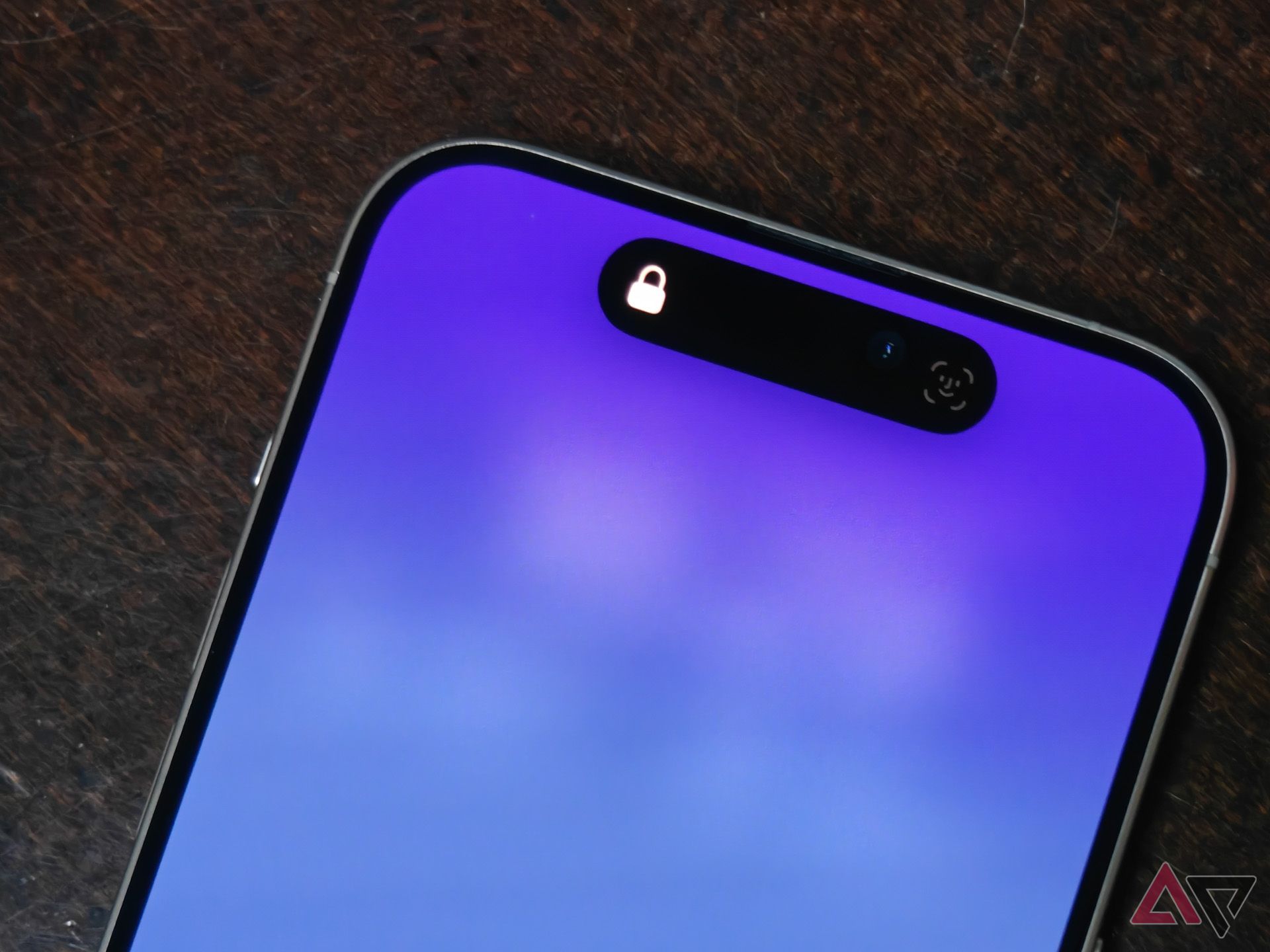
I’ve been a critic of Face ID for a long time. The iPhone 16 Pro has changed my opinion of it, but I feel my earlier criticisms are still valid. My issues with the technology were based on my 2020 iPad Pro, which always takes longer to unlock than I’d like, and fails to recognize me at least twice a day.
Apple has clearly done something to improve Face ID in the four years since that iPad came out, though, as my experience with it on the 16 Pro has been nothing but positive.
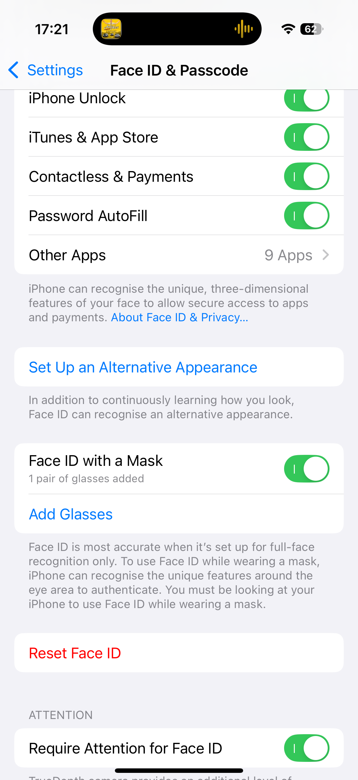
What’s impressed me most about Face ID is how well it works with masks. Apple added mask compatibility in 2022, at a time when many were still wearing them due to the pandemic.
That’s not the case now, but there are some people who’ll greatly benefit from it, and I’m one of them. I have Sleep Apnea and I have to use a CPAP machine to ensure I don’t stop breathing during the night. The sleep mask I wear is bulky and covers everything from my chin to the bridge of my nose. Face ID still works, although I do have to angle the phone slightly differently so that it can see my eyes better.
Face ID is impressive, but I don’t like it more or less than a fingerprint scanner. My S24 Ultra has one of the very best fingerprint readers on the market and I like it equally compared to FaceID, and it isn’t a feature that would pull me to one device over another.
I want to keep this camera
It just works, until it doesn’t
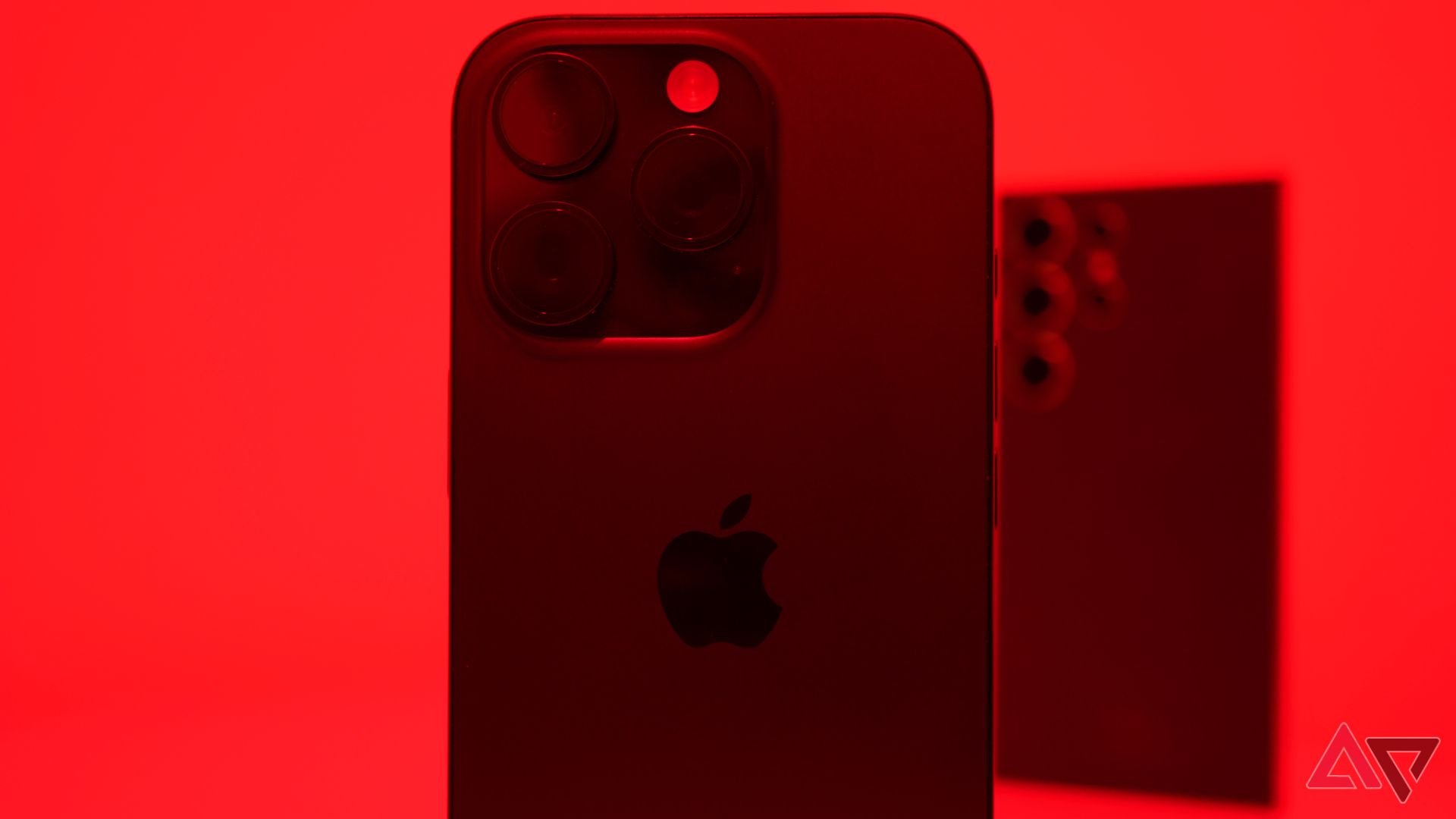
I take a lot of photos. It’s something I’ve enjoyed doing since I got a phone with a camera when I was eight, and the iPhone 16 Pro’s camera has won me over. It takes sharp, natural photos every time I press the shutter button (provided it’s the one on the screen) and the experience has been nothing short of excellent.
I love my Galaxy S24 Ultra in many ways, but the camera hasn’t been one of them. Shutter lag is still a persistent issue, somehow worse than the Galaxy S23 Ultra, and I can’t say I’ve taken a single photo with it that I’m completely happy with. Photographic styles are a big win for me, too. I love playing with look-up tables (LUTs) when I edit photos and having them built into the camera makes it easier to use, especially as they can be edited or removed after the image is taken.
The 4K 120FPS slow-motion on the 16 Pro is also more fun than it has any right to be. I’ve stopped to record some of the most mundane things that I’d usually ignore, just because they look cool in slow-motion. Android phones can do slow-motion, too, and my S24 Ultra is quite good at it, but the footage from the iPhone is just sharper and more pleasing to look at.
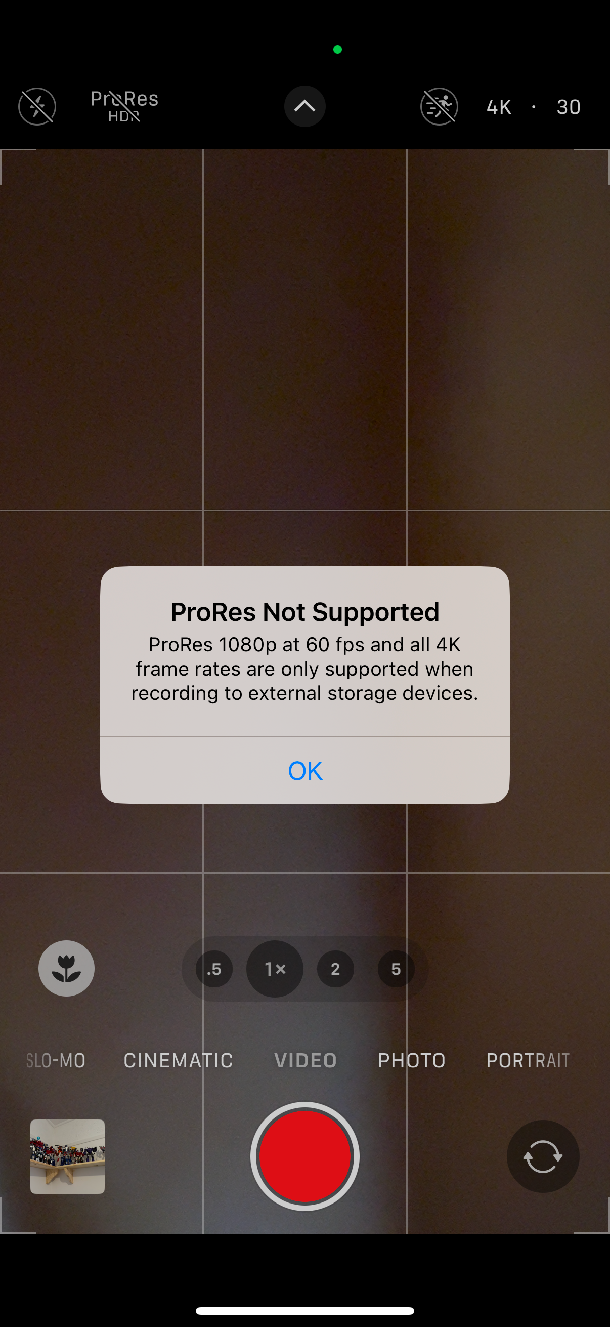
There is one thing that irritates me about this camera experience: the base iPhone 16 Pro only comes with 128GB of storage, which means I can’t use 4K ProRes video without connecting to an external storage device. Sure, I can mess around with 1080p ProRes, but I shouldn’t have to. If one of the “pro” features requires a minimum of 256GB, then maybe the “pro” iPhones should all come with at least that much storage.
A $1,000 phone with only 128GB of storage is indefensible to me, especially when the Galaxy S24+ and S24 Ultra all start at 256GB.
Notifications are bad
Sorry, Mom, I didn’t see your text because my phone is stupid
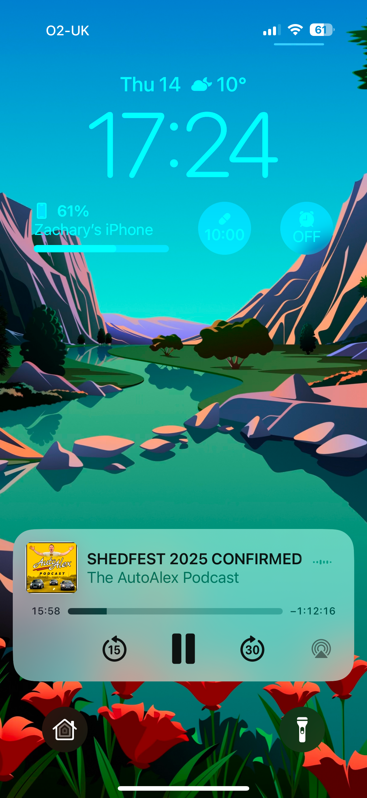
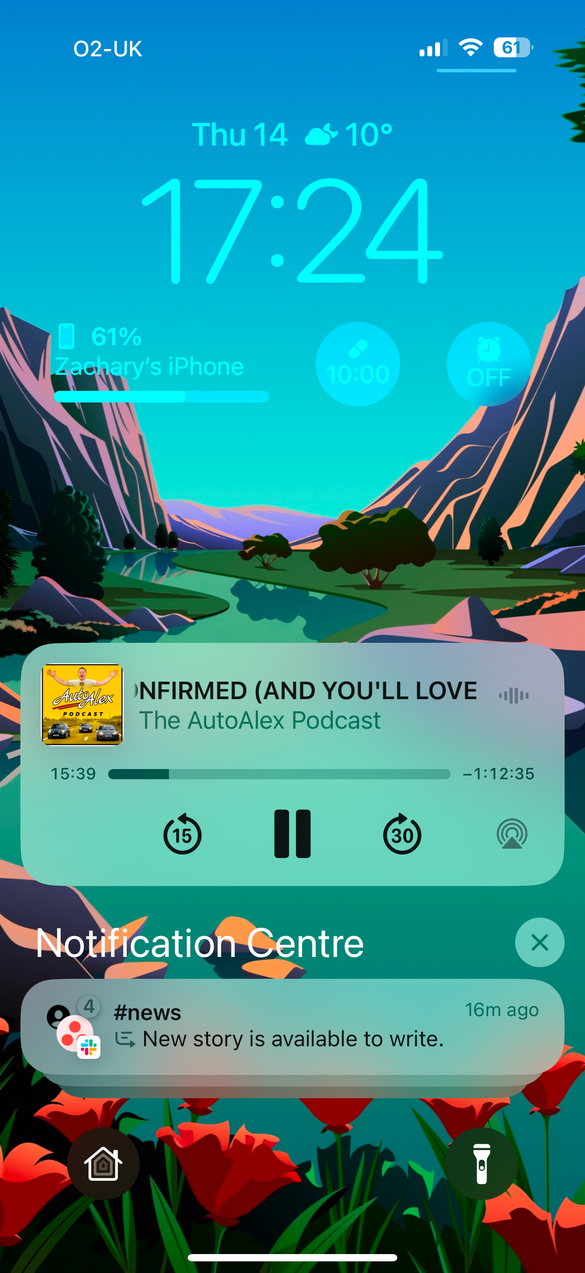
Android users have complained about the notifications on iOS for as long as I can remember, and I’m going to do the same thing now. The lock screen is an absolute joke, as it only shows notifications that have arrived since you locked the phone. There have been so many occasions where a message has arrived just a fraction of a second before I locked the phone, so it doesn’t show on the lock screen at all.
My biggest issue, though, is the lack of a notification counter in the status bar. Unless you’re on the home screen and can see the badge over an app icon, there’s no way of knowing you have any notifications unless you swipe down into the notification center.
Yes, new messages show as a banner at the top of the screen, but if you miss them because you happen to be looking up at something else when it arrives, you might not realize a message has arrived until minutes, or even hours later.
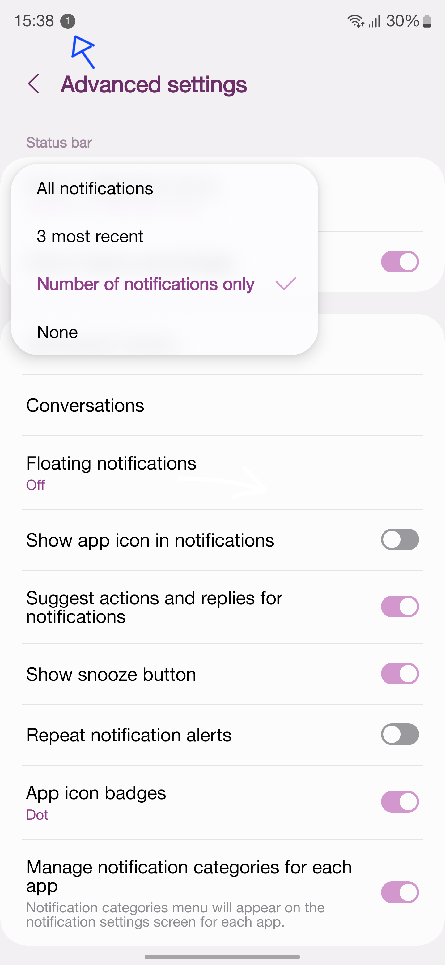
Because of how wide the Dynamic Island is, the iPhone can’t show a stack of notification icons like Android does, but there is plenty of room for a feature that Samsung has had in One UI for years. On Samsung phones, you can remove the individual notification icons in the status bar and replace them with a numeric counter that shows how many notifications you have. This alone would eliminate my biggest complaint with the iPhone experience.
I like Siri and Apple Intelligence
Siri can do the things I use my voice assistant for
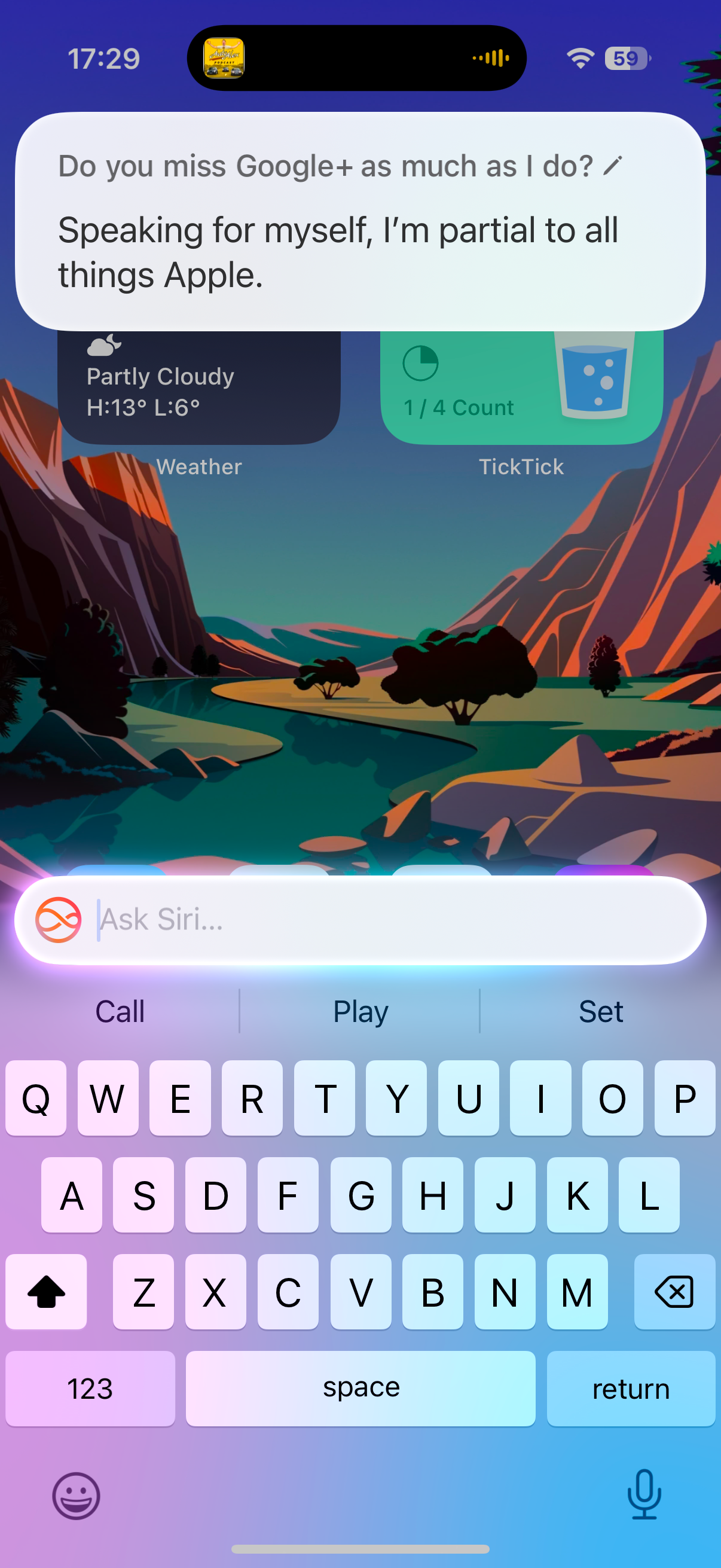
Siri has been the butt of many jokes over the years. That’s not entirely unwarranted, but despite its limitations, it’s the voice assistant I enjoy using the most. Having conversations with Gemini is cool, but all I want from these voice assistants is to reliably ask for music, control my lights, and message people when driving, and Siri does that better than Bixby, Google Assistant, or Gemini.
When I’m driving, “Hey Siri” commands work better than Google Assistant in Android Auto ever has. In the month I’ve been using it, it hasn’t made a single mistake while driving, writing text messages of varying lengths perfectly every time. It’s also compatible with all the apps that I use; Google Assistant can’t compose messages to Telegram, it can only reply to ones you receive. Siri isn’t as fancy as other assistants, but it does what I want.
Apple Intelligence is something else I’ve enjoyed using. I don’t care about generating weird-looking images or having a conversation with an AI. What I do care about is smart features that actually save me time, and there’s one thing Apple Intelligence does here that none of these other AIs do: Notification priority.
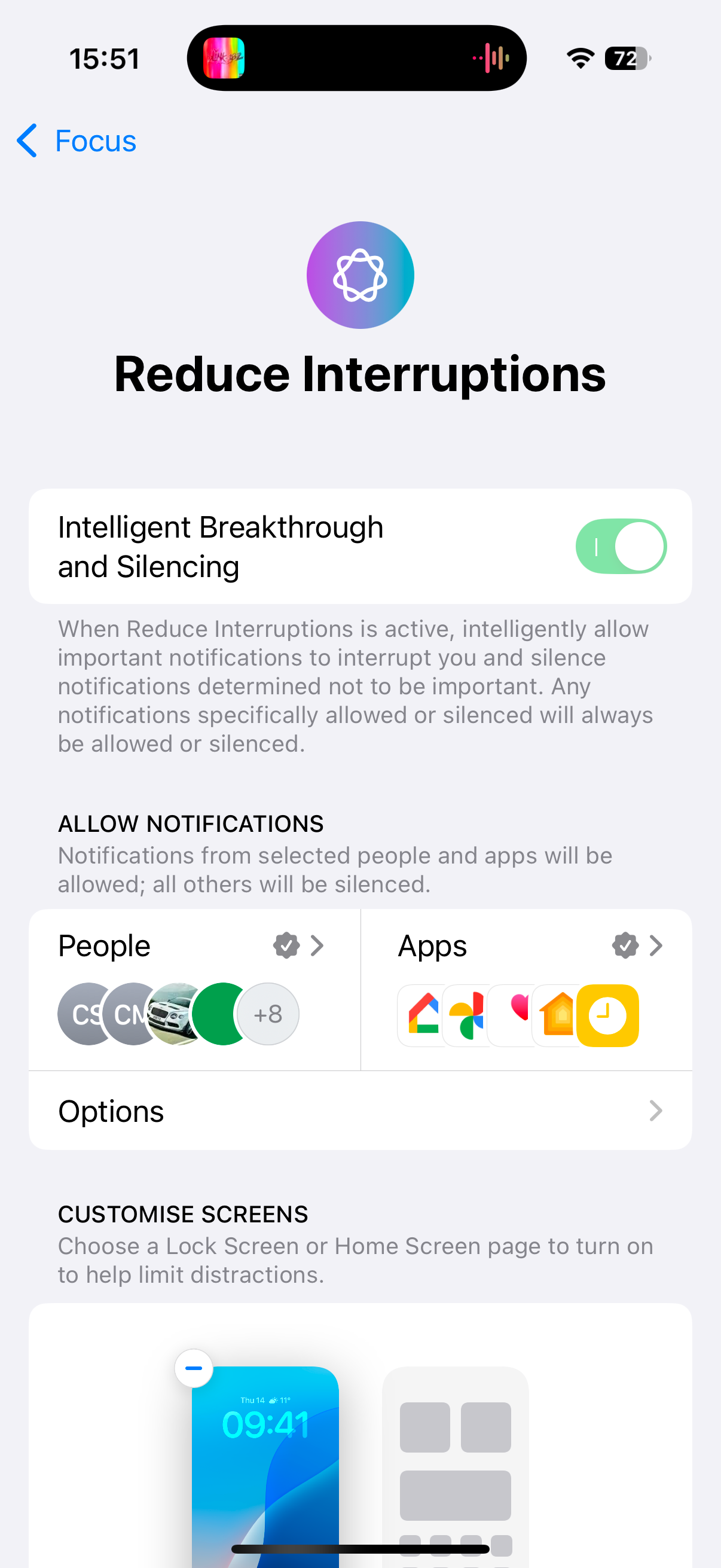
The Focus Modes in iOS are something I’ve envied for a long time, and they’ve gotten better with Apple Intelligence. Apple devices with Apple Intelligence get a toggle inside focus modes called “Intelligent Breakthrough and Silencing.” When enabled, Apple Intelligence will scan through notifications and surface the ones it thinks are important, even if the contact or app that sent it isn’t on the allowed list.
To illustrate how this works, if I were to get a text from someone with a funny meme or a generic question, the iPhone would hide those away until later. If I get a text that’s urgent, like a message to tell me a loved one is ill, or that there’s been a change to plans later that day, it’ll prominently alert me of that message and tell me that it could be important.
I know this sounds like a small thing, but it’s truly the only AI feature I’ve used that has had an impact on how I use my phone. The AI editing, chatbots, and photo generation on Pixel, Samsung phones, and even on the iPhone 16 Pro are fun to mess around with, but it isn’t something I’d miss if it went away.
Could I switch to the iPhone?
Yes, I could. That’s not the conclusion I expected to come to when I started, but there’s a lot more to love than I expected. It isn’t the slick, perfect experience some Apple fans will have you believe; I’ve had bugs and crashes, in and out of the beta, just as I have on Android. The notifications suck and the keyboards are horrible, even third-party ones.
I could get used to those things, though, and the overall smoothness and the almost-flawless camera make up for those things in spades.
I’m not going to switch to an iPhone, though. I like Android, and it continues to be the OS I feel most at home with. However, I could switch if I had to. I could get used to the differences between iOS and Android, and I’d be happy once I become acclimated. Trying something new is always a good thing; there’s more to love here in iOS than I expected, and I’m excited to see what Apple does in the future.
This articles is written by : Nermeen Nabil Khear Abdelmalak
All rights reserved to : USAGOLDMIES . www.usagoldmines.com
You can Enjoy surfing our website categories and read more content in many fields you may like .
Why USAGoldMines ?
USAGoldMines is a comprehensive website offering the latest in financial, crypto, and technical news. With specialized sections for each category, it provides readers with up-to-date market insights, investment trends, and technological advancements, making it a valuable resource for investors and enthusiasts in the fast-paced financial world.
