If your Fire TV home screen suddenly looks different, you’re not alone.
Last month, Amazon started rolling out its biggest Fire TV update in years, with rounder icons and some big navigation changes. While the launch has been gradual, it seems to have picked up speed this past week based on what I’m hearing from readers and seeing on my own devices.
The new home screen is arriving first on the latest Fire TV Stick 4K Plus and 4K Max streaming players, along with Amazon’s Fire TV Omni Mini-LED TVs. Support for more streaming players and TVs is coming this spring.
While the new home screen is an improvement overall, it’s also in some ways a step backwards. Either way, it takes some getting used to, as a lot of features have changed, moved, or disappeared.
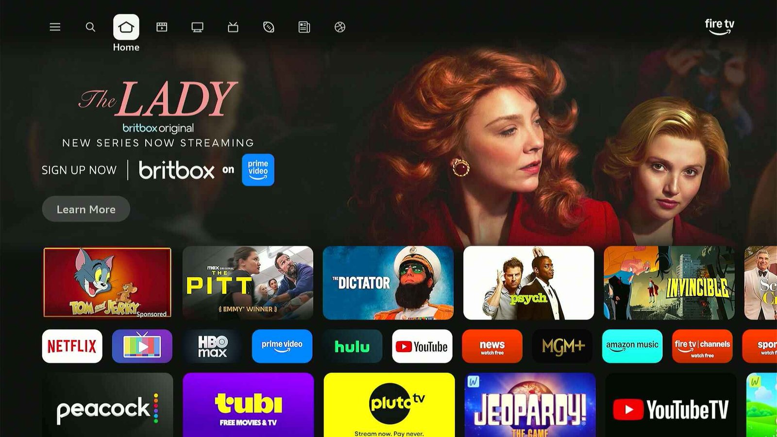
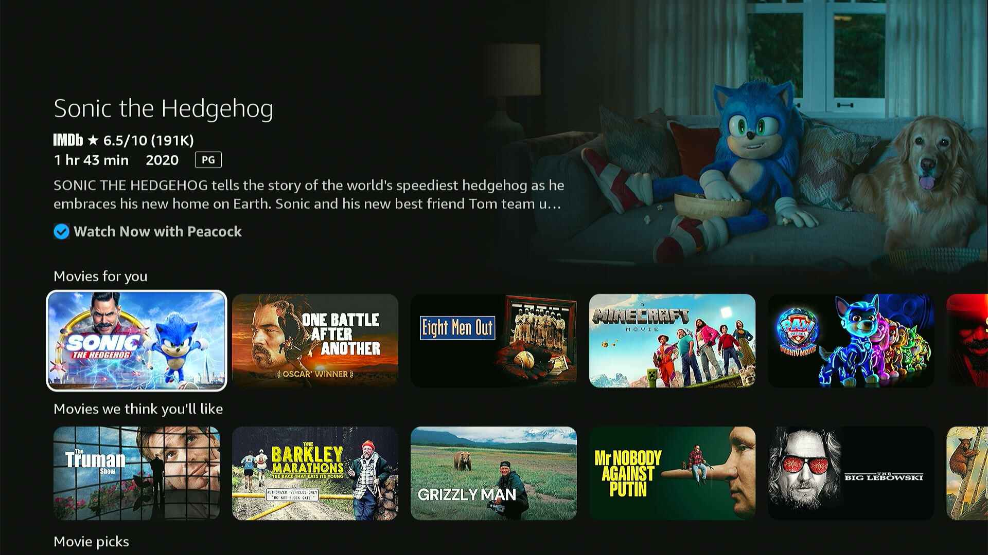
Your apps have moved
Amazon is ditching the upper app row where you could pin up to six favorite apps. It also got rid of the “Recently-used” app row a bit further down the screen.
Instead, all your apps will appear in a single row, a few clicks down from the top navigation bar. You can move or uninstall them by long-pressing the Select button, but there’s no way to arrange them by recency. You also can’t highlight your apps anymore to see recommendations from them.
The new nav bar
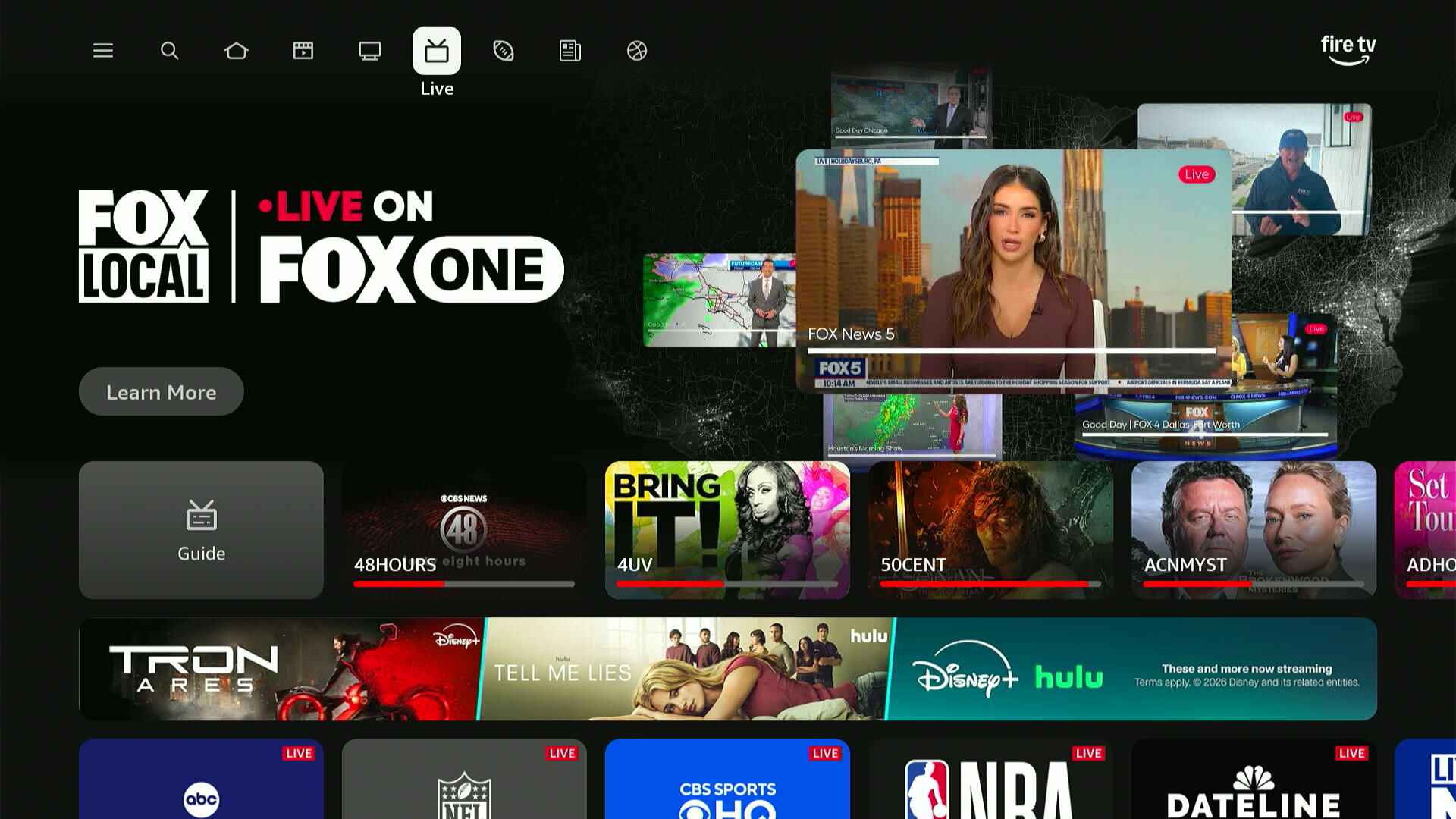
With the upper app row gone, Amazon has also moved the menu options that once sat next to them.
Those options now appear in an expanded navigation bar at the top of the screen. The old Home, Live, and Search options are all up there, along with shortcuts to Movies, TV Shows, News, and Sports. Those sections aren’t entirely new, but Amazon previously buried them deeper down in its menu system. (Amazon may also show time-limited sections here as well, like the current one for March Madness.)
Sadly, the new design demotes the “My Stuff” section (with your watchlist and purchases) from the nav bar entirely. You’ll find it by clicking the menu button on your remote.
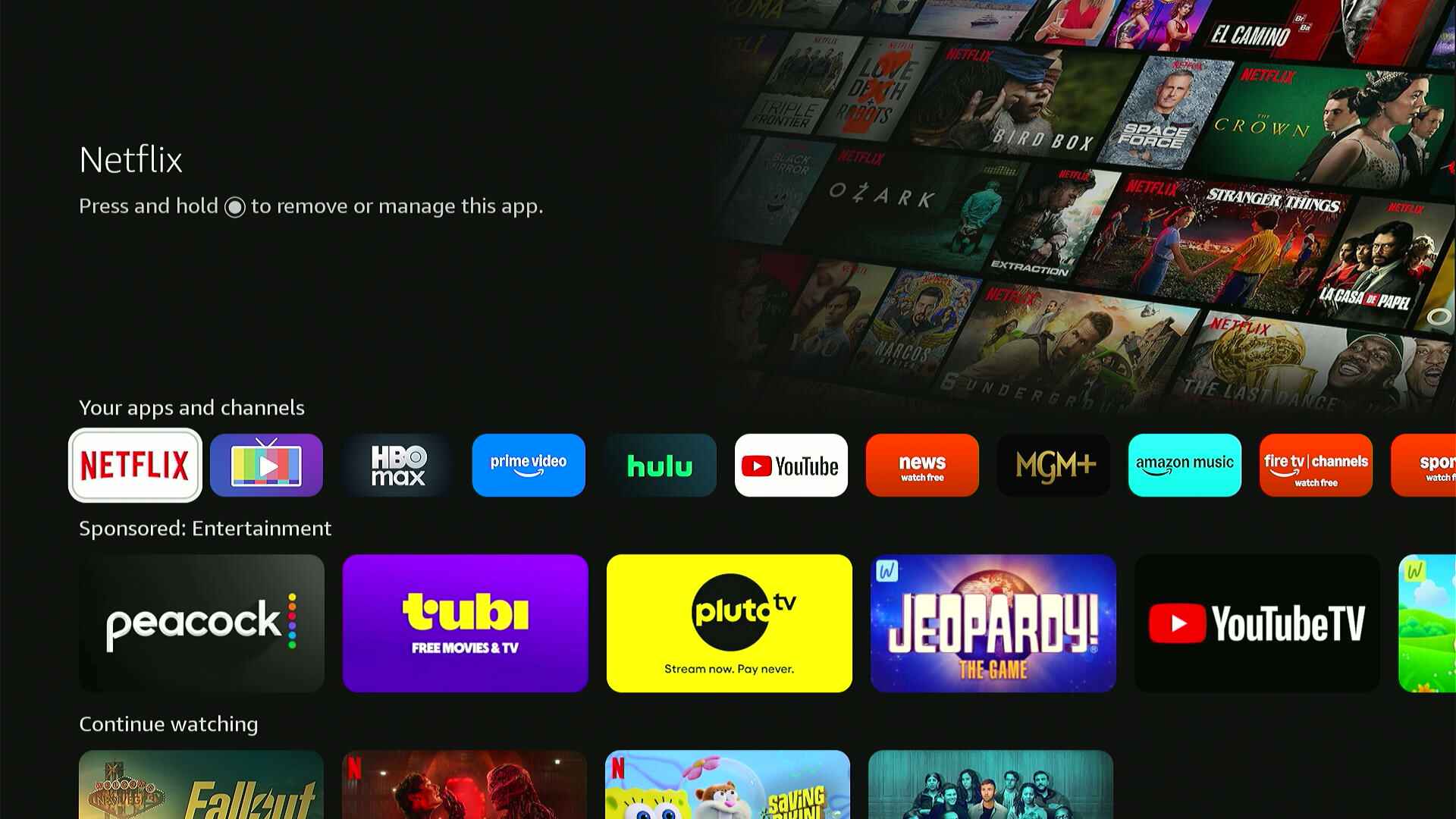
New button behavior
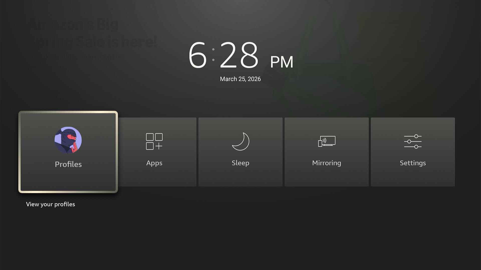
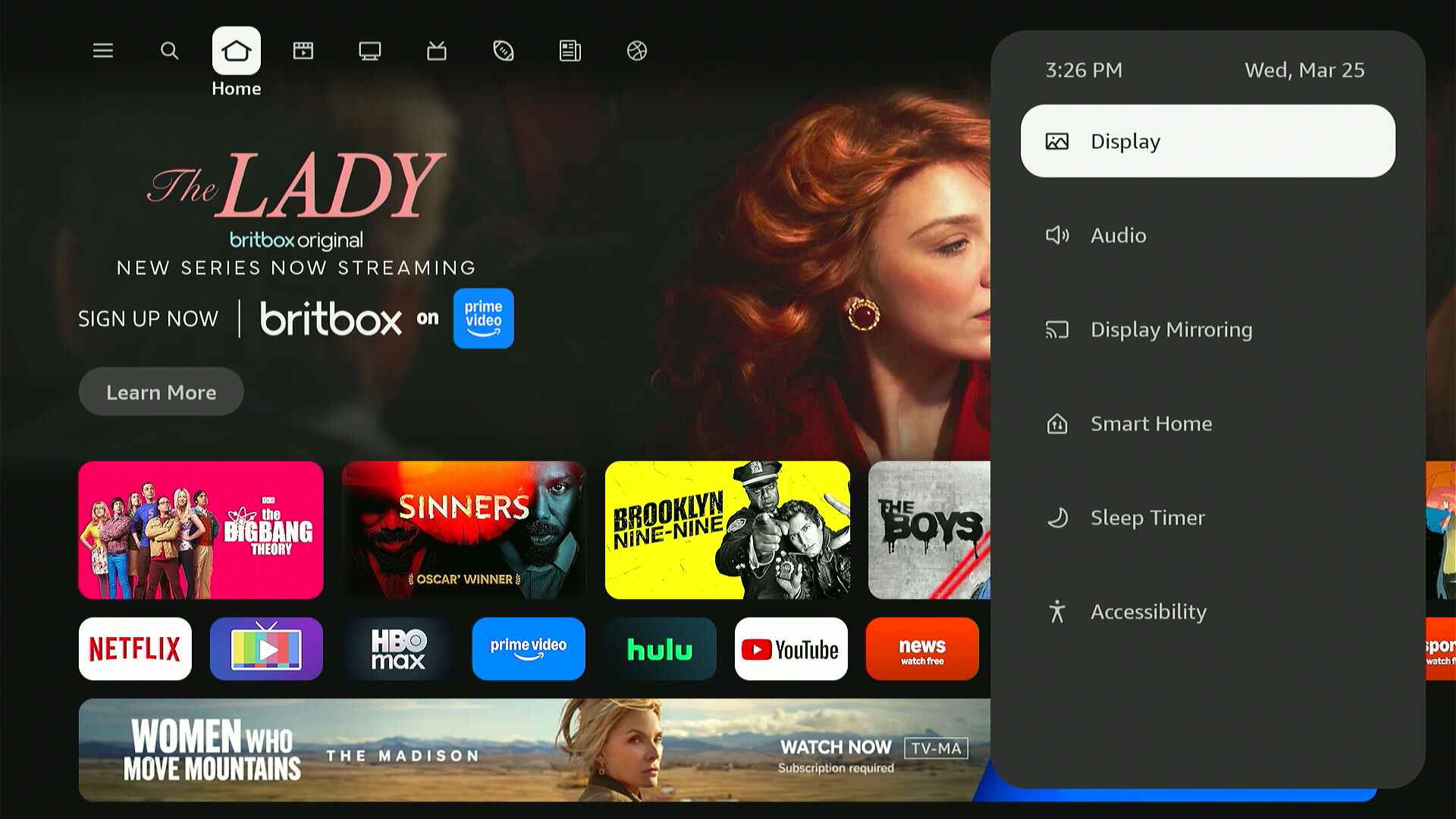
With the old Fire TV design, long-pressing the Home button gave you shortcuts to things like the profile selector and settings menu, while the Menu button showed quick options for the currently highlighted home screen item. Now, Amazon has strangely split different settings between these two buttons:
- Home button long-press: Display and audio settings, sleep timer, smart home controls, accessibility settings.
- Menu button: Profile selector, Appstore, Games store, My Stuff menu, smart home controls (again), settings shortcut.
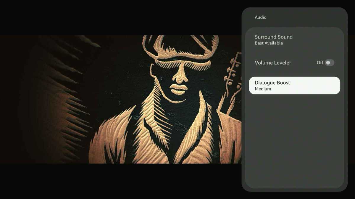
I do like that the Home button long-press now works within content, so you can tweak display settings or control things like dialog enhancement without going back to the home screen. Still, the Menu button would make more sense for these features to me, and the split between Home and Menu functions feels unintuitive.
Jared Newman / Foundry
Meanwhile, long-pressing the Select button now accomplishes what the menu button used to do. You can use this to move or uninstall apps, add items to your watchlist, and remove items from the “Continue Watching” row.
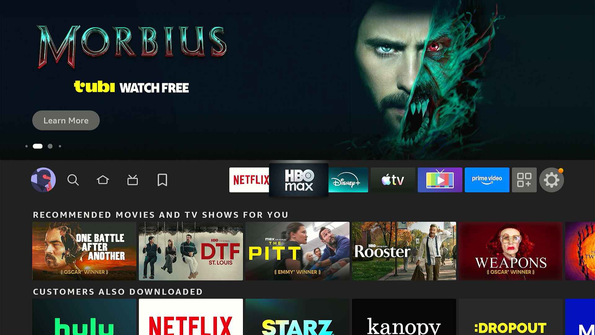
Slightly less annoying ads and trailers
Sadly, the Fire TV home screen still prominently features sponsored content in its top carousel and a big banner ad further down the home screen. Amazon continues to use these spaces for ads that have nothing to do with entertainment, such as snacks and skin care products.
But the update does bring one subtle improvement: Clicking up from the starting position on the home screen no longer pulls down a full-screen video for whatever Amazon’s advertising. You’ll still see those trailers if you linger too long on the “Watch” or “Learn More” buttons, but at least they’re harder to invoke by accident.
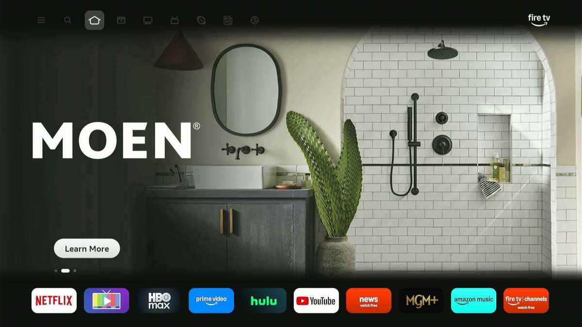
Ads don’t expand like this unless you hover on the “Learn More” button for a second or two.
Jared Newman / Foundry
As always, you can (and should) prevent these ads from auto-playing by heading to Settings > Preferences > Featured Content, then turning off both “Allow Video Autoplay” and “Allow Audio Autoplay.”
Miscellaneous changes
Some other things I’ve noticed while comparing the new and old Fire TV home screens:
- There’s no longer any way to view all of your installed apps in a grid menu, so you’re mainly expected to use that one long app row on the home screen now.
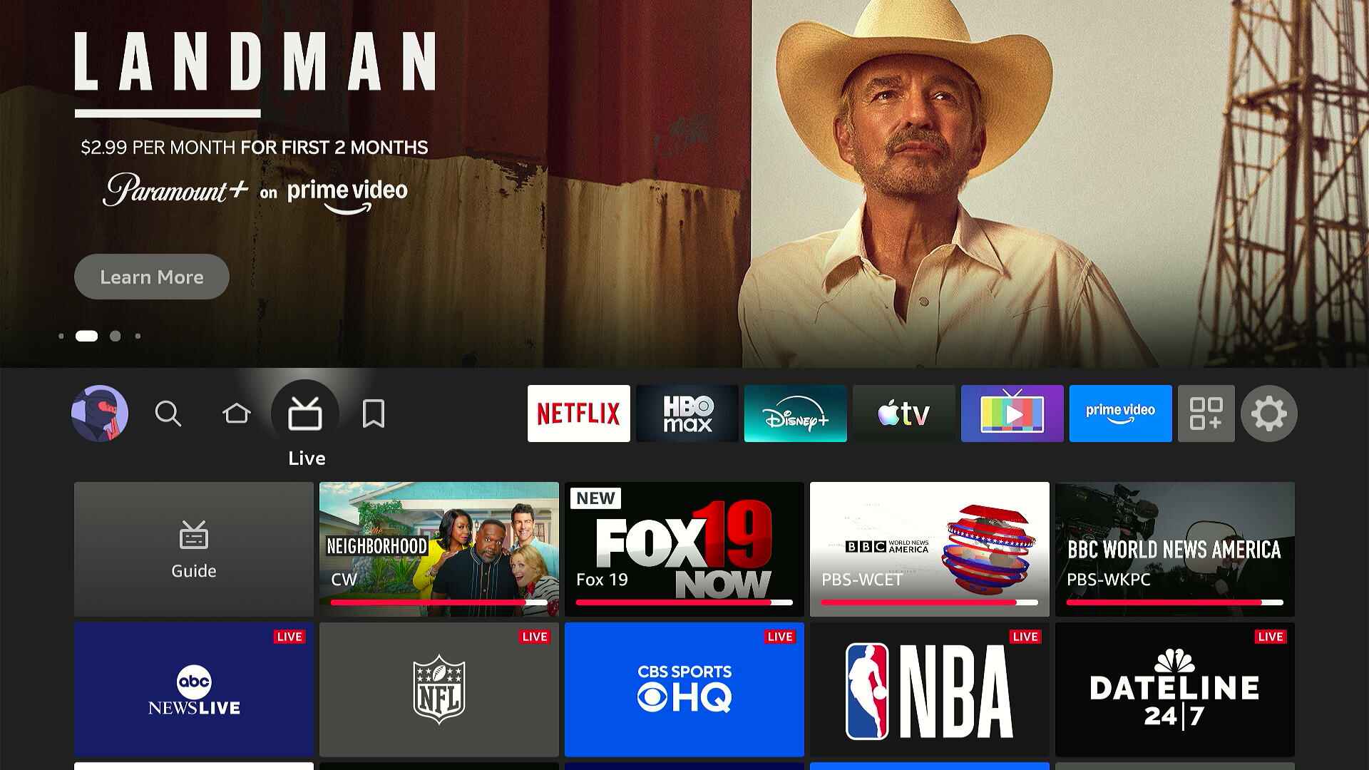
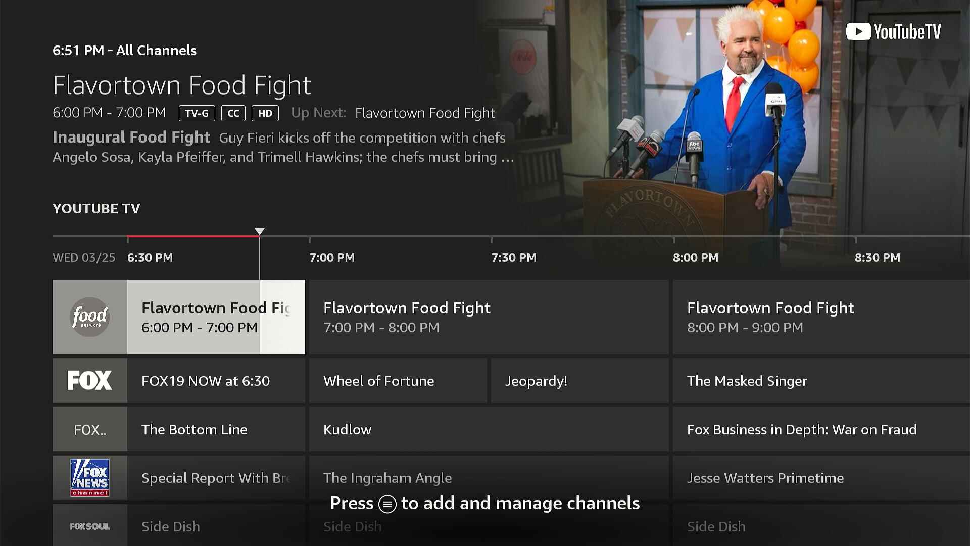
- Fire TV’s live TV guide no longer requires extra clicks to see its various filtering options, and it also recommends some live channels at the top of the grid.
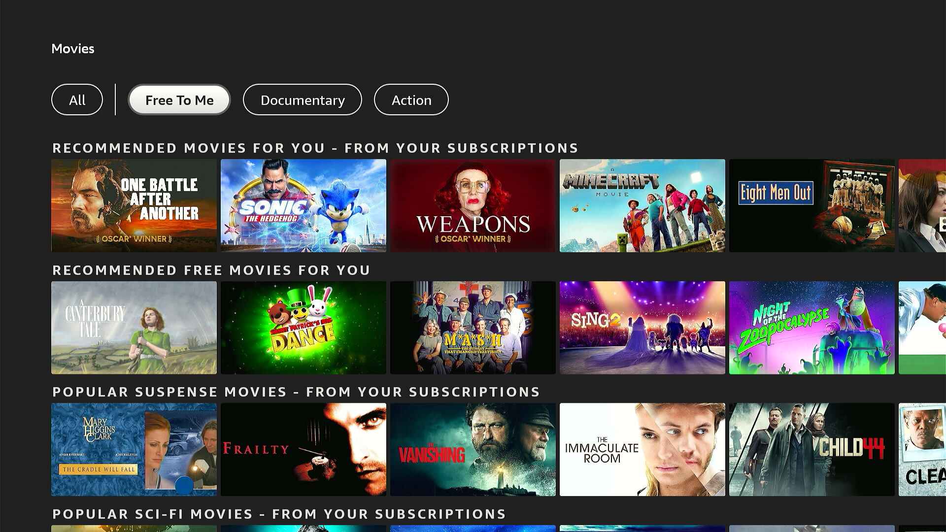
- The Movies and TV Shows sections no longer have a “Free to Me” filter, which only showed content from free services or your subscriptions. Too bad.
- The Appstore no longer has a dedicated games filter. Click the Menu button on your remote and head to the Games section instead.
- To put your Fire TV device to sleep, it’s best to just hit the remote’s power button, but you can still do it through software by long-pressing Home, heading to Sleep Timers, and selecting “Sleep Now.”
What’s still annoying
Meanwhile, some of my longstanding gripes with the Fire TV interface remain unaddressed:
- You still can’t control which streaming services feed into the Fire TV’s home screen recommendations. Google TV has been letting users do this for years. This isn’t hard to do; Amazon just doesn’t care enough to give users a modicum of agency.
- There’s still no quick, glanceable indication of which streaming service a recommendation belongs to on the home screen. Instead you have to highlight each item and wait for that information to load.
- You still can’t hide or reject Fire TV’s home screen recommendations, like those in the “Next up for you” row.
Overall, I like the new Fire TV home screen better than the old one. It makes your full app list easier to reach, gives the “Continue Watching” row more visual prominence, and adds in-video access to display settings and dialog enhancement. The rounder icons also just look a bit less utilitarian.
Still, it’s no less a reminder that your value to Amazon is not in what you pay for the Fire TV hardware, but in what else it can sell you now that you’ve bought it.
Sign up for Jared’s Cord Cutter Weekly newsletter for more streaming TV advice.
This articles is written by : Nermeen Nabil Khear Abdelmalak
All rights reserved to : USAGOLDMIES . www.usagoldmines.com
You can Enjoy surfing our website categories and read more content in many fields you may like .
Why USAGoldMines ?
USAGoldMines is a comprehensive website offering the latest in financial, crypto, and technical news. With specialized sections for each category, it provides readers with up-to-date market insights, investment trends, and technological advancements, making it a valuable resource for investors and enthusiasts in the fast-paced financial world.