Microsoft has redesigned all the icons for its various Office applications (officially known as Microsoft 365 apps), this time focusing on color gradients and contrasts. The result? These new Microsoft Office icons are now more colorful, more curvy, and more approachable.
We’ve known for some time that Microsoft Office apps were getting new icons (thanks to a leak). But they’re official as of today, according to Jon Friedman (CVP of Design and Research for Microsoft 365) in this Microsoft Design blog post.
Microsoft is rolling out the new design to users with immediate effect. In the post, Friedman explains the redesign’s significance:
When it comes to outsized impact, it’s hard to debate the almighty icon. No bigger than a postage stamp, these tiny symbols are gateways to entire experiences, distilling complex ideas, product abilities, and brand identities into a single, memorable image. By evoking emotion, sparking curiosity, and giving intuitive guidance, they make technology more accessible and approachable.
The last time Microsoft updated the Office icons was in 2018. Below, you can see all the redesigned icons side by side:

Microsoft
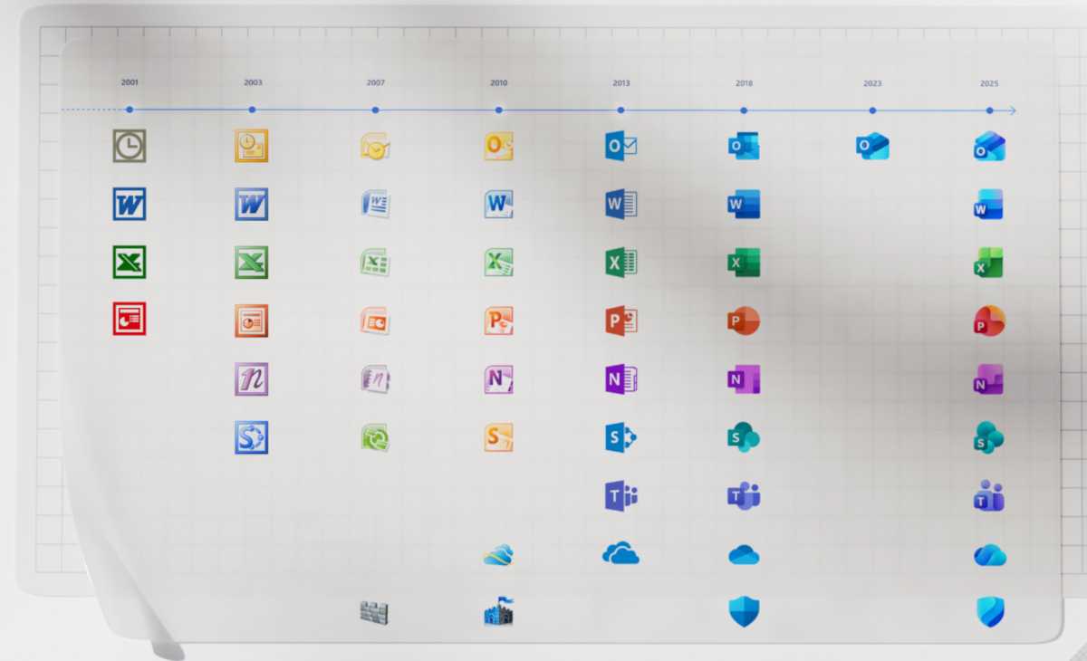
We find the following illustration from Microsoft particularly interesting, which shows the evolution of these icons over the years:

Microsoft
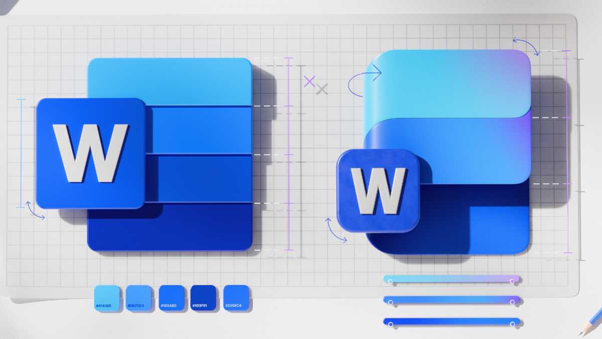
And here’s a direct comparison of how the Word icon changed:

Microsoft
Microsoft stuck to four main principles in this redesign:
Delightfully simple: To maintain familiarity while streamlining the visual experience, we graphically simplified the icons for clarity and reduced visual noise. Whereas Word’s icon previously used four horizontal bars, the new version uses just three, improving legibility at small sizes and creating more visual concision.
Fluid shapes: We’ve moved away from bold, static solidity to embrace softer, more fluid forms. Sharp edges and crisp lines are replaced by smooth folds and curves, giving the icons a sense of playful motion and approachability.
Rich and colorful: The color palette has been dramatically refined. Where gradients were once subtle, they’re now richer and more vibrant, featuring exaggerated analogous transitions that improve contrast and accessibility. This shift makes the icons feel brighter, punchier, and more dynamic.
Instantly recognizable: Letter plates were much debated because they’re valuable real estate and icons following the core 10 Office ones no longer use them. Their brand equity is so strong, however, that we decided to keep them—maintaining our heritage while also modernizing them through a more cohesive visual integration with the overall design.
The reference to the omnipresent AI is almost inevitable as well, with the design of the new Microsoft 365 icons clearly influenced by the Copilot icon. The new look is intended to represent a more connected design system and the influence of Copilot on Microsoft 365.
This articles is written by : Nermeen Nabil Khear Abdelmalak
All rights reserved to : USAGOLDMIES . www.usagoldmines.com
You can Enjoy surfing our website categories and read more content in many fields you may like .
Why USAGoldMines ?
USAGoldMines is a comprehensive website offering the latest in financial, crypto, and technical news. With specialized sections for each category, it provides readers with up-to-date market insights, investment trends, and technological advancements, making it a valuable resource for investors and enthusiasts in the fast-paced financial world.
